June 24, 2009

A fantastic slippy app


Mapumental http://mapumental.channel4.com
Private Beta


This is just one cool web mapping application. I think the possibilities for this down the road are endless.


This application, built by mySociety brings together OpenStreetMap data together with public transportation travel times, house prices and a value of how scenic the location is to your liking. All together in a great mashup of open source data, paid data and socially derived data.

I didn't play with the "Scenicness" factor too much - I was more than thrilled to be playing with the Traveline and Land Registry property sale information.


The 'slippy map', as our UK friends like to often refer the slider-friendly map, is fantastic. Instead of tons of panning and zooming and selecting we often see in GIS web applications, there is a series of sliders that instantly show you the effects of your parameter changes.

Marks for:

- Big plus for their help page - great example of some of the things that should be mentioned on the site: data delivery, concurrency and who to see for access.


- Ease of use - can't get any easier than three slider bars and a few pan / zoom controls. Love it.


- Ov
erall site design - again, with the rest of the site - it is a simple nice design that just works. Doesn't over crowd you with 100 different options or buttons. It does it's thing and does it well.

- Speed - fantastic, the transport time meshed with housing prices barely takes a second to very quickly slide in and out based on your parameters. They've done a brilliant job here.

- Also with speed - the online map tips that pop up as you pan and zoom around the map are great. Instant access to the calculated transport ti
me and the median housing prices, for anywhere.


- The future - I'm excited to see the type of other applications this could lead to. Think temporal GIS with other spatial datasets coming together into a simple to use application... I can't wait.

Marks against:


- As much as I love Open Street Maps data, concept, etc. - I just can't get over the fonts they use on their mapping data. Don't like them at all.


Not a fault on the Mapumental site at all - they are just using the OSM data direct. But I have to find something wrong with the application... right?!?

Overall Grade: A+


You can also watch a good demo of the site here:


June 23, 2009

The New York Times gets it right


Finally a great new website to review. Some people thought it was too much information, but I love it.

Murder: New York City
http://projects.nytimes.com/crime/homicides/map

(in support of this article: http://www.nytimes.com/2009/06/19/nyregion/19murder.html)

It's very simple GUI with an address lookup, date slider bar, standard Google pan and zoom controls.


Marks for:

- Easy GUI to understand. No data overload like some sites.
Data is to the point and not overbearing. No need to throw extra data at this app to make it into a portal for all crimes, etc. The story was about homicides in New York City - this map is exactly that.

- Love that they didn't use the standard Google Maps colors. Even though they are using the Terrain data, they have still dumbed the colors down for a great visual effect. There is no need for the standard Google Terrain colors of having green parks and blue water - that doesn't add anything to a homicide map and the team that put this together knows that. Hats off to them.

- Nice touches when you only have one year selecte
d and the bar graph highlights the corresponding bar and value.

- Fits very well with the overall design of The Ne
w York Times website itself as well.

Marks against:


- I'll have trouble finding fault with this map app. I think the only thing I can think about is that the coloring for the sequential thematic
(Age of victim, Age of perpetrator, etc.) is a little too similar. Would have liked to see a little more variance here to highlight the cohorts a little more. But this is a very, very minor detail.

- No help that I can see. Am I being to harsh here? Do
we just expect people who would be on The New York Times online edition just know how to work a Google mashup? I know how to work the controls and understand layer control, scale dependencies and how to operate the map controls, but does the average Joe?

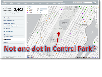
- I have a hard time believing that in over six years there hasn't been a single homicide in Central Park. What am I missing here?!?


Overall Grade:

Having trouble with this. I'm thinking A+, but think I'll sti
ck with an A for the time being. I think it's great in all respects, but it didn't blow my socks off as other maps (to come) have. So a solid A for The New York Times.

Talk about timing...


An interesting "discussion" on Twitter at the moment including @cageyjames and @dbouwman - give them a follow if you're on Twitter.

Some of the Dave's highlights:


- "The thing about the sample viewer is that the architecture is good, but ppl are not re-mixing the UI enough..."

- "that's why consultants who roll out vanilla "Sample Viewers" should be publicly ridiculed..."

- "if "Joe GIS" rolls out a Sample Viewer, OK, it's not his job to bring the kung-fu... maybe ESRI should do a skinning contest???"

That is the number one reason I started this blog. I'm so sick of the standard, tired, vendor-created templates getting sometimes national praise, when there are many options out there to spice things up a bit.

I'm on the case - there are many a boring GIS website to be outed...

June 22, 2009

The annoying child with the latest toys, but doesn't know how to use them

Santa Rosa County Florida Planning & Zoning Department

http://maps.roktech.net/santarosa/ags/zoning/

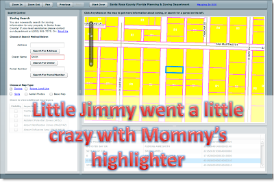
When @MapsRus sent me this link and told me to check out this site, at first I just saw a pretty ugly initial map and didn't think much of it. Then it wouldn't load a map. Then when it finally started up, I found out it was going to be pretty easy to find a few faults in this web application.

The developer says that it was created using the ArcGIS Flex API and spotlighted at the ArcGIS Server Live User Sites. I would have thought someone in ESRI's cartographic team could have helped them out quite a bit with a few key points.

When you can get the map to load, it loads and pans quickly. With the initial map you are presented with an ugly zoning map in an array of colors. Switch the map type to a few different options and you'll see we're not dealing with just one ugly map, but a plethora for your viewing pleasure.

Zoning = ugly. Future Land Use = ugly. Soils = everyone knows some soils maps are downright fantastic (think William Smith), but this one has a whole host of other problems I'll outline in a minute.

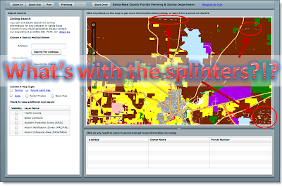
Why is a Zoning map not colored all the way through? Why are streets dissecting the zoning polygons to create little no-data splinters throughout the map?

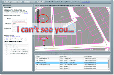
The query results map is boring (grey and pink, always a great color combo for splashy maps) and the parcel lines run over the map text. Not good design.

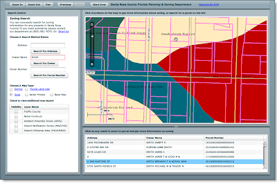
The soils map – let’s leave color selection alone for a minute – I’m assuming this is a standardized soil layer template. Look at the map – no legend at all and text just splattered everywhere that is meaningless for someone trying to decipher the information on the map. Some of the text is capitalized, some is not. Some of it is replicated on the same polygon feature and is spread from sea to shining sea.

When a query result is displayed, you get the parcel data overlaid on top of the soil map to hide even more text:

Another stunning example of aesthetic representation:

And lastly (there is just too much to go over on this site) – a pet peeve of mine is inconsistency. You win a prize if you can spot the differences in capitalization:

- Choose A Search Method Below
- Choose A Map Type
- Check to view additional map layers

Ok, down to the grading…

Marks for:

- Using the latest in technology

- Being on the cutting edge of Web 2.0 goodness

- A good UI that works well

Marks against:

- Using the latest in technology and not using any of the cartographic tools in it

- No online help

- Spelling and capitalization errors and inconsistencies

- Poor color choices

- Zooming tools – no ‘zoom all’ / ‘zoom home’ other than ‘Start Over’

- Hidden /unreadable text underneath geographic features

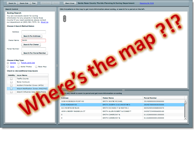
- Map fail – after playing around with this map for a while, you are back at the familiar map:

Overall Grade:

C –

(goes to show you that even the latest in technology can’t save some ugly design and color choices)

[Edit: annoying as all hell - some of my fonts are getting all mucked up in this post. Will fix... eventually]

Just sitting at the back of the class, trying hard not to get noticed

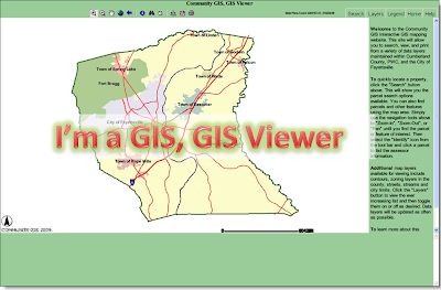
Cumberland County Community GIS
http://152.31.99.8/

Well you know things aren't going to go well when you're using Firefox and you get the following message:

It doesn't tell me what browsers are supported, just says that my Firefox Netscape??? browser isn't. That's helpful to the average user.

From a functional standpoint, this site works. It does what it is supposed to do - display GIS data. Does it add anything vs. the standard ArcIMS Viewers that are a dime-a-dozen?!? Nope, sorry.
When the parents ask "How'd Johnny do on his assignment?", if the teacher replies "well, he handed it in"... you can read between the lines.

Search tools are pretty standard - searching by Parcel / Owner / Address / Street Name either take you to the place on the map, or punts you to another website
with joined information (Owner info for example).

Marks for
:

- Dynamic legend - changes with what you have in the map

- Help is there - which is always important and they get marks for that
- State Plane Coordinate display
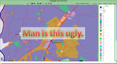
- Standard colors are average (except for their Zoning layer - see below for example)

- Dynamic layer control - turn something on - it turns on. Turn it off? You guessed it.

Marks against:

- Scale bar is hard to read in their bold font
- No halo text around some features make them difficult to read when the aerial image is turned on

- No mention of downloading data
- No mention of metadata
- Displaying database column headings in query results - the average person doesn't care to see "ST_NAME" or "ST_NAME_ID" in a query result.
- The standard ArcIMS info tool isn't intuitive - if I want to select a parcel but my active layer is the streets layer, there should be a drilldown option so that all visible layers are presented. I don't want to have to keep going back to Layers / Active then Info every time I want to do a select query. This is because they haven't done anything outside the standard features of the ESRI ArcIMS HTML Viewer.
- So good they named it twice "Community GIS, GIS Viewer"


This map? Not so pretty.


Overall Grade:

C

(very average, a passing grade, but hasn't done anything extra to impress)

Where's the Map ?!?


Tough to review a GIS web mapping application when there ain't no map. This was sent in from a Twitter follower (@MapsRus).

http://maps.roktech.net/santarosa/ags/zoning/

I'm getting zilch on Firefox 3 and IE 7 for this application.
Everyone else having issues or is this one of those sites that doesn't tell you which browsers it's optimized for and you have to use BrowserShots to figure out what works / what doesn't. I'll keep an eye on this site so when it's back up, I'll give it a go.


June 19, 2009

Not really the Ten Commandments, but...

Somewhere between throwing a dart and coming up with a crazy list of criteria needed for reviewing online GIS web applications, I suppose it's time to show you where I'm coming from.

I'm bored of this:
and believe it or not, there is still a LOT of them out there.

But then again, there are some gorgeous sites out there as well with tons of functionality, new designs, colors that typical color-blind GIS people didn't put together... sites that are interesting and pleasing to the eye.

Is t
hat so hard to ask?!?

Throughout this blog I'll commend or criticize based on a number of factors:


1. Overall look and feel of the site

- Does it look pleasing to the eye or more like a dog's breakfast?
- Do the colors actually blend and match well or have they been put together by the same person in your office who also works on the flattening divisor defining a WGS-84 projection?
- Does it share the same common threads, values, color schemes, etc. as the corporate image? Or are you a one-off renegade department that has always wanted to stick-it-to-the-man by having your own identity? And if so, does it work?

2. Overall purpose of the site

- Is this a GIS website because your boss told you that "our department needs one"?

- Is this a GIS website because your ESRI Account Manager sold you on ArcIMS 10 years ago?
- Does it actually serve a purpose? Is there something beyond the simple point, click and “hey look - there's my house!!!” or “oooh… aerial photos”?

3. Data

- Is this 100% of your own data or are you also jumping on the bandwagon and using Google Maps? That’s fine – but is it more than just pin pricks on a map?

- Anyway to download / consume the data in any other way? Any instructions for that?
- Metadata? Ever heard of it?

4. Usability of the site


- Who is the audience?
- If the general public, is there *good* online help to guide people through the site?

- If specialist GIS folk, is there *good*
online help to guide people through the site?
- Is it a typical pan/zoom/identify site or do you roll differently and make every user go to the help because you make the zoom buttons different ‘just to be different’
- Is this a web mapping site or a GIS site? Do you know the difference?

5. Geek entities:

- Do you mention what’s running in the backroom powering this site? Do you care? Some people do and scream from their soapbox and some people don’t. I like knowing what is behind the scenes just like any other GIS geek.

6. Speed / Reliability
:

- Suggestion from a comment and I was going to put this on (and did mention it Twitter) but forgot to blog it. Speed is a huge factor in GIS web applications. People want their maps and they want them now! Nothing I hate more than watching a demo at a conference and the map just grinding away. I think about the poor guy at the local County office on a slow pipe trying to squeeze their maps through the firewall ...

- Reliability is a big question as well - I've seen plenty a website throw up Java Script errors left, right and center.
What else do you look for in a GIS Web Application?

June 18, 2009

Different options

Another thing I want to focus on is different technologies.

Everyone knows about ESRI, Intergraph, MapInfo Pitney-I-can't-believe-that-is-the-name-of-a-GIS-company Boyes and Autodesk. There are options for the Open Source stack as well including MapServer, OpenLayers and the flavor of the day mashup side of things with Google Maps, Virtual Earth Bing, Does-Anyone-Use-Yahoo-Maps, etc.

I want to review them all, because honestly, ripping into one and loving another is just too easy. I want to be blown away by some of these apps and some of them should just never see the light of day.

Jumping in head first

Your mother always told you to look before you leap. No diving in the shallow end.

Well, as I have a bunch of sites I want to review, I figure I should get some sort of 'checklist' going as to what is a good GIS & Web Map Application. I don't want to get into scoring these things on a scale of 1 to 100 or anything, but a checklist is in order.

Submit your thoughts or point me in the direction of what you think makes a great web mapping application.


First Web App "reviewed"

To be honest, I haven't "reviewed" this site yet from a functionality perspective - I just can't get past the first glance.

Sweetwater County, WY MapServer application:
http://www.sweet.wy.us/mapserver/map.html


When the map text and labels are that garbled at first viewing you have to think of a few things:

1) turn the text layers off
2) fix the damn text placement
3) have some dynamic dependencies so that the labels will turn on at a certain scale so that they are not so offensive at first glance. I mean really?

If the tools you use can't do the right job (MapServer... text placement / conflict detection?!?!) - then work around them. Throw some buffers around the names, do some padding, use smart scaling, something... anything...
Ok... must cool off. Many, many others to write about.

What I will say however is the site has some nice touches and I do actually like the application. The Help is quite good (always important) and I love the info bar at the bottom that includes projection, lat / long, scale, etc., etc. They've done a good job here.


The site itself is quite quick as well - so that's always super plus in my books.


The colors on the Voter Precincts leave a lot to be desired, but not many GIS'ers get coloring correct. Thank God for Cynthia Brewer!!

More to come...

Let's get the party started...

I have to admit - I never thought I'd get started in blogging. I usually don't have that much to say. But I know good when I see it. I know bad when I see it. I usually can pick up on something good and bad to say about any GIS and Web Mapping Application out there. Some are downright awful (I'm thinking ArcIMS 3.0 template out-of-the-box awful) and some are fantastic.

On this blog, you'll see discussions, posts, links, etc. to some of the best and some of the worst.

Feel free to submit what you think are everything from crap to great and anything in between.