Finally a great new website to review. Some people thought it was too much information, but I love it.
Murder: New York City
http://projects.nytimes.com/crime/homicides/map
(in support of this article: http://www.nytimes.com/2009/06/19/nyregion/19murder.html)
It's very simple GUI with an address lookup, date slider bar, standard Google pan and zoom controls.

Marks for:
- Easy GUI to understand. No data overload like some sites. Data is to the point and not overbearing. No need to throw extra data at this app to make it into a portal for all crimes, etc. The story was about homicides in New York City - this map is exactly that.
- Love that they didn't use the standard Google Maps colors. Even though they are using the Terrain data, they have still dumbed the colors down for a great visual effect. There is no need for the standard Google Terrain colors of having green parks and blue water - that doesn't add anything to a homicide map and the team that put this together knows that. Hats off to them.
- Nice touches when you only have one year selected and the bar graph highlights the corresponding bar and value.
- Fits very well with the overall design of The New York Times website itself as well.
Marks against:
- I'll have trouble finding fault with this map app. I think the only thing I can think about is that the coloring for the sequential thematic (Age of victim, Age of perpetrator, etc.) is a little too similar. Would have liked to see a little more variance here to highlight the cohorts a little more. But this is a very, very minor detail.
- No help that I can see. Am I being to harsh here? Do we just expect people who would be on The New York Times online edition just know how to work a Google mashup? I know how to work the controls and understand layer control, scale dependencies and how to operate the map controls, but does the average Joe?
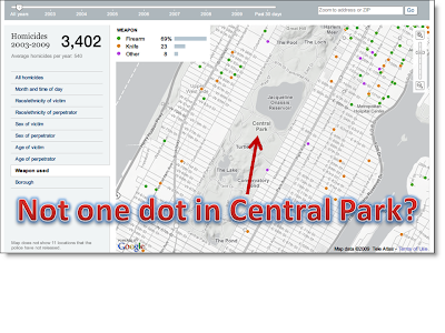
- I have a hard time believing that in over six years there hasn't been a single homicide in Central Park. What am I missing here?!?
 Overall Grade:
Having trouble with this. I'm thinking A+, but think I'll stick with an A for the time being. I think it's great in all respects, but it didn't blow my socks off as other maps (to come) have. So a solid A for The New York Times.


I agree with the majority of the comments here. I believe that they have done an admirable job of reporting data in a fashion that enables the viewer/reader to determine and derive their own connection to the data and the story.
ReplyDeleteOn the negative though, there is a story published with this map. In that story are descriptions of trends that are not only not shown in the map, they are derived from data not representable in the map.
It is a detractor for me to be invited to look for trends in the data and then to not be provided with access to the data that indicate the trends they have found. For example they indicate that most homicides are perpetrated in the heat of summer or on a weekend evening. The individual records have a date field as one can see easily from the info popup (A nice touch btw). It would have been moderately easy to upgrade to allow users to querry by weeknight or by season or even both more effectively allowing the data to reinforce their story.
Overall I like it a lot and think this is a good step in the direction that web maps should go. But given the lack of tie to the simultaneously published story, I would downgrade this to a B+
-CommunityGIS
@CommunityGIS - agreed, any of extra level of data openness is always welcomed.
ReplyDelete