Santa Rosa County Florida Planning & Zoning Department
http://maps.roktech.net/santarosa/ags/zoning/

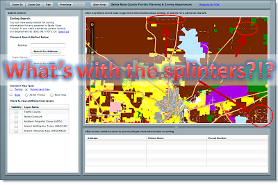
When you can get the map to load, it loads and pans quickly. With the initial map you are presented with an ugly zoning map in an array of colors. Switch the map type to a few different options and you'll see we're not dealing with just one ugly map, but a plethora for your viewing pleasure.
Zoning = ugly. Future Land Use = ugly. Soils = everyone knows some soils maps are downright fantastic (think William Smith), but this one has a whole host of other problems I'll outline in a minute.
Why is a Zoning map not colored all the way through? Why are streets dissecting the zoning polygons to create little no-data splinters throughout the map?
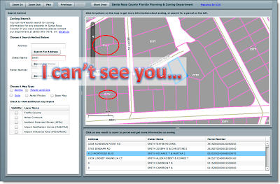
The query results map is boring (grey and pink, always a great color combo for splashy maps) and the parcel lines run over the map text. Not good design.
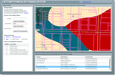
The soils map – let’s leave color selection alone for a minute – I’m assuming this is a standardized soil layer template. Look at the map – no legend at all and text just splattered everywhere that is meaningless for someone trying to decipher the information on the map. Some of the text is capitalized, some is not. Some of it is replicated on the same polygon feature and is spread from sea to shining sea.
When a query result is displayed, you get the parcel data overlaid on top of the soil map to hide even more text:
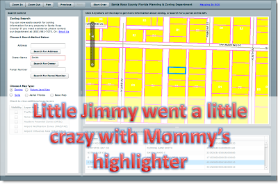
Another stunning example of aesthetic representation:
And lastly (there is just too much to go over on this site) – a pet peeve of mine is inconsistency. You win a prize if you can spot the differences in capitalization:
- Choose A Search Method Below
- Choose A Map Type
- Check to view additional map layers
Ok, down to the grading…
Marks for:
- Using the latest in technology
- Being on the cutting edge of Web 2.0 goodness
- A good UI that works well
Marks against:
- Using the latest in technology and not using any of the cartographic tools in it
- No online help
- Spelling and capitalization errors and inconsistencies
- Poor color choices
- Zooming tools – no ‘zoom all’ / ‘zoom home’ other than ‘Start Over’
- Hidden /unreadable text underneath geographic features
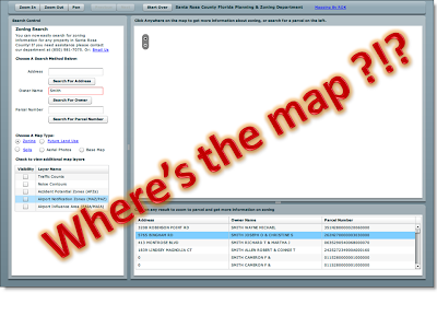
- Map fail – after playing around with this map for a while, you are back at the familiar map:
Overall Grade:
C –
(goes to show you that even the latest in technology can’t save some ugly design and color choices)
[Edit: annoying as all hell - some of my fonts are getting all mucked up in this post. Will fix... eventually]


Cartographically, I see your points. We had to stick to to standard templates. However, missing map can be explained in this post: http://www.roktech.net/devblog/index.cfm/2009/6/29/We-are-going-to-need-a-bigger-boat We were totally unprepared for what happened.
ReplyDeleteAnyway, whoever you are, I'm glad you sorta liked it.